When visiting a customer’s site recently, the owner expressed concern about some of the images printed on his TrueVIS VG2-540 looking flat and lacking vibrancy when using a TR2 CMYK-Lc-Lm-Lk-Or ink configuration.
At first, I thought this might be due to the TR2 inks not being shaken on a regular basis, but the customer ensured me that this is always done when the display panel’s “Shake Alert” message is displayed. (This is important too)
The customer said that he only experiences the undesirable results when attempting to print bright vibrant Spot/Process colors using Adobe Illustrator. At that point, I asked him if we could open one of these “problem” images in Illustrator.
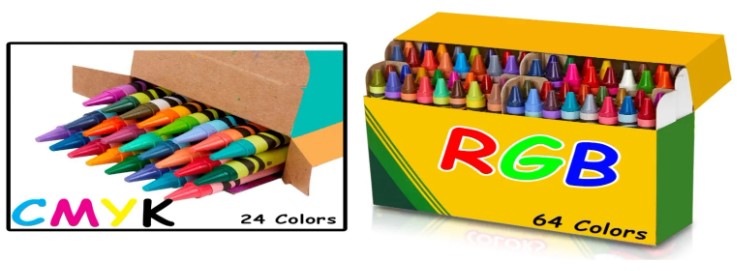
The first thing I always look for is whether a CMYK or RGB color space was used to design the image. It was determined that CMYK was used, leading to a general discussion about CMYK vs. RGB color spaces and how important designing images in RGB can be. The reason for this is simple, there are a lot more colors (“Crayons”) in RGB than CMYK output. That being said, you cannot convert an image (vector or raster) from CMYK to RGB thinking that it will print more vibrant – you can’t add colors to an image that’s already limited in color (24 Crayons). My recommendation is to design your images in RGB color space (64 Crayons). I use “AdobeRGB-1998.”
Once your RGB files are ready for output, Roland VersaWorks will do the color conversion from RGB to CMYK, taking into consideration your printer’s ink configuration (Let VersaWorks convert to CMYK, etc.).
Armed with this information, this customer went on to design and output using RGB (a larger box of Crayons) and was extremely pleased with the graphic results.


